Visualising Financial Data: Unraveling Insights Through Graphical Representations

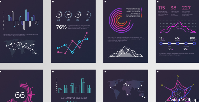
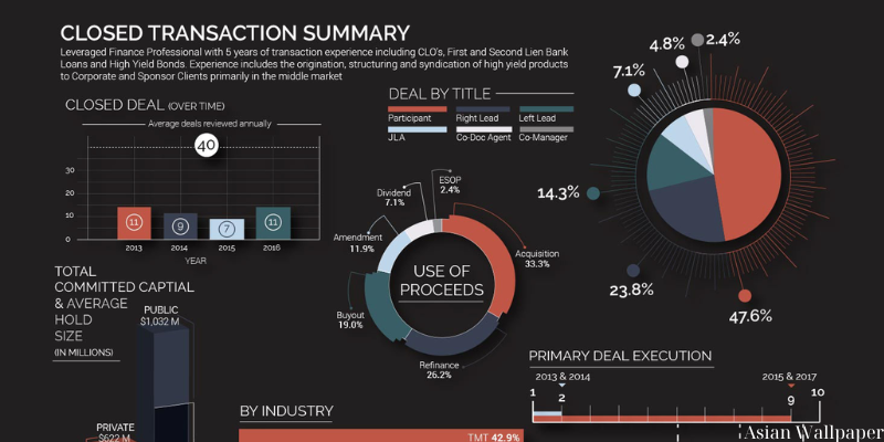
In today’s data-driven world, the ability to effectively interpret and communicate financial information is paramount. With vast amounts of data generated daily, traditional tabular formats often fall short in conveying insights swiftly and intuitively. Visualizing financial data through graphs, charts, and other graphical representations offers a powerful solution. By transforming complex numbers and trends into visual stories, stakeholders can grasp key insights at a glance, enabling more informed decision-making. In this article, we explore the importance of visualizing financial data and delve into various techniques and tools to unleash its full potential.
Importance of Visualizing Financial Data:

Visualizing financial data offers numerous benefits that extend beyond mere aesthetics. Here are some key reasons why it’s essential:
- Clarity and Accessibility: Graphical representations simplify complex financial concepts, making them accessible to a broader audience. Visuals such as charts and graphs distill intricate data into easy-to-understand visuals, facilitating quicker comprehension.
- Identification of Trends and Patterns: Visualizations allow stakeholders to identify trends, patterns, and anomalies that may not be immediately apparent in raw data. Whether it’s spotting seasonality in sales figures or detecting irregularities in expense patterns, visualizations serve as a lens for deeper analysis.
- Enhanced Decision-Making: By presenting data in a visual format, decision-makers can make more informed choices. Whether it’s assessing investment opportunities, optimizing budget allocations, or monitoring performance metrics, visualizations provide actionable insights that drive strategic decisions.
- Effective Communication: Visuals transcend language barriers and convey information more effectively than text alone. Whether presenting financial reports to stakeholders or pitching investment strategies to clients, visualizations foster clearer communication and alignment of objectives.
Techniques for Visualizing Financial Data:

Several techniques can be employed to visualize financial data effectively. Let’s explore some popular methods:
- Time Series Analysis: Time series plots are instrumental in analyzing financial data over time. Line charts, for instance, visualize trends in stock prices, GDP growth, or revenue streams across different periods, enabling stakeholders to discern long-term patterns and fluctuations.
- Bar and Column Charts: Bar and column charts are useful for comparing categorical data, such as quarterly sales figures, market shares, or budget allocations. These visualizations provide a clear overview of relative performance metrics, aiding in benchmarking and performance evaluation.
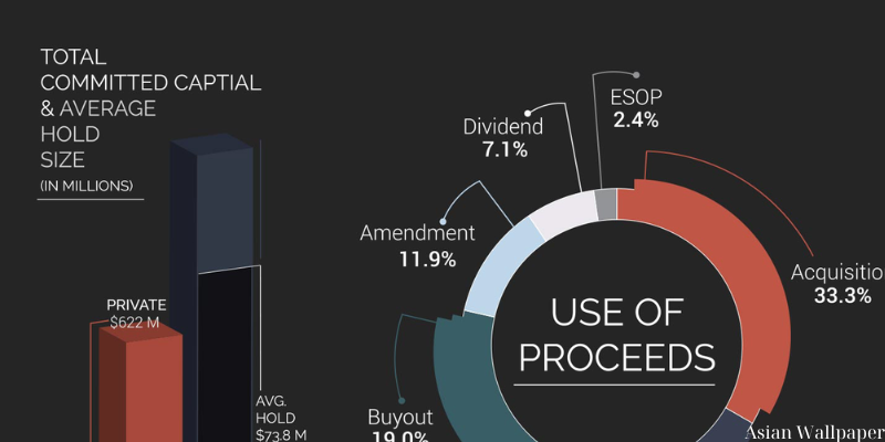
- Pie Charts: While often criticized for their overuse, pie charts can effectively represent proportions within a dataset. For instance, a pie chart can illustrate the composition of a portfolio by asset class or depict the distribution of expenses across various categories.
- Heatmaps: Heatmaps offer a visual representation of multidimensional data, with colors indicating relative values. In financial analysis, heatmaps can visualize correlations between asset classes, sector performance, or risk exposure across a portfolio.
- Histograms and Distribution Plots: Histograms and distribution plots are valuable for analyzing the distribution of financial variables, such as stock returns or asset prices. By visualizing the frequency and magnitude of data points within different intervals, these plots provide insights into underlying distributions and skewness.
Tools for Visualizing Financial Data:

Numerous tools and software platforms facilitate the creation of visually compelling financial visualizations. Here are some popular options:
- Excel: Excel remains a ubiquitous tool for financial analysis and visualization. Its charting capabilities allow users to create a wide range of graphs and charts, from basic line charts to complex waterfall diagrams.
- Tableau: Tableau is a powerful data visualization platform that enables users to create interactive dashboards and visualizations. With its drag-and-drop interface and robust analytics features, Tableau is widely used in financial services for exploring and presenting data insights.
- Python (Matplotlib, Seaborn): Python, along with libraries such as Matplotlib and Seaborn, offers a flexible environment for creating custom visualizations. From simple plots to sophisticated statistical graphics, Python’s versatility makes it a favorite among data scientists and analysts.
- Power BI: Microsoft Power BI is a business analytics tool that enables users to visualize and share insights from their data. With features such as data modeling, interactive dashboards, and real-time analytics, Power BI is well-suited for financial reporting and analysis.
- Google Data Studio: Google Data Studio allows users to create dynamic and interactive reports using data from various sources, including Google Sheets, Google Analytics, and BigQuery. Its intuitive interface and collaboration features make it an attractive option for financial teams seeking to visualize and share data insights.
Conclusion:
Visualizing financial data is not just about making numbers look appealing; it’s about unlocking insights and driving informed decision-making. By leveraging graphical representations, stakeholders can gain a deeper understanding of financial trends, identify opportunities and risks, and communicate findings more effectively. Whether through time series analysis, bar charts, or interactive dashboards, the ability to visualize financial data empowers organizations to navigate the complexities of the financial landscape with clarity and confidence. As the volume and complexity of financial data continue to grow, mastering the art of visualization will be indispensable for staying ahead in today’s dynamic business environment.
Conclusion: So above is the Visualising Financial Data: Unraveling Insights Through Graphical Representations article. Hopefully with this article you can help you in life, always follow and read our good articles on the website: Asian Wallpaper


